
Defining the Surface Before Production
Glazing and digital inkjet printing help establish the colour, pattern and surface appearance of ceramic and porcelain tiles. For importers, distributors and private label buyers, the starting point is an agreed design reference linked to a specific tile body, size and finish.
We review whether your requirement can be met through an existing design or needs sample development. A marble effect, stone texture or decorative pattern must be assessed at the intended tile size. A small reference image alone cannot define the appearance of a complete production range.
Preparing the Body and Glaze Layers
Before decoration, the tile surface needs suitable preparation for the selected production route. Dust, uneven application or an unsuitable combination of body and glaze can affect the fired appearance.
Depending on the product, an engobe or base glaze may be applied before printing, with additional glaze layers used where required. These layers influence the background colour and how the printed design appears after firing.
A change in tile body or glaze can therefore require another sample review, even when the artwork remains unchanged. Available surface finishes and glazing options should be considered alongside the design.
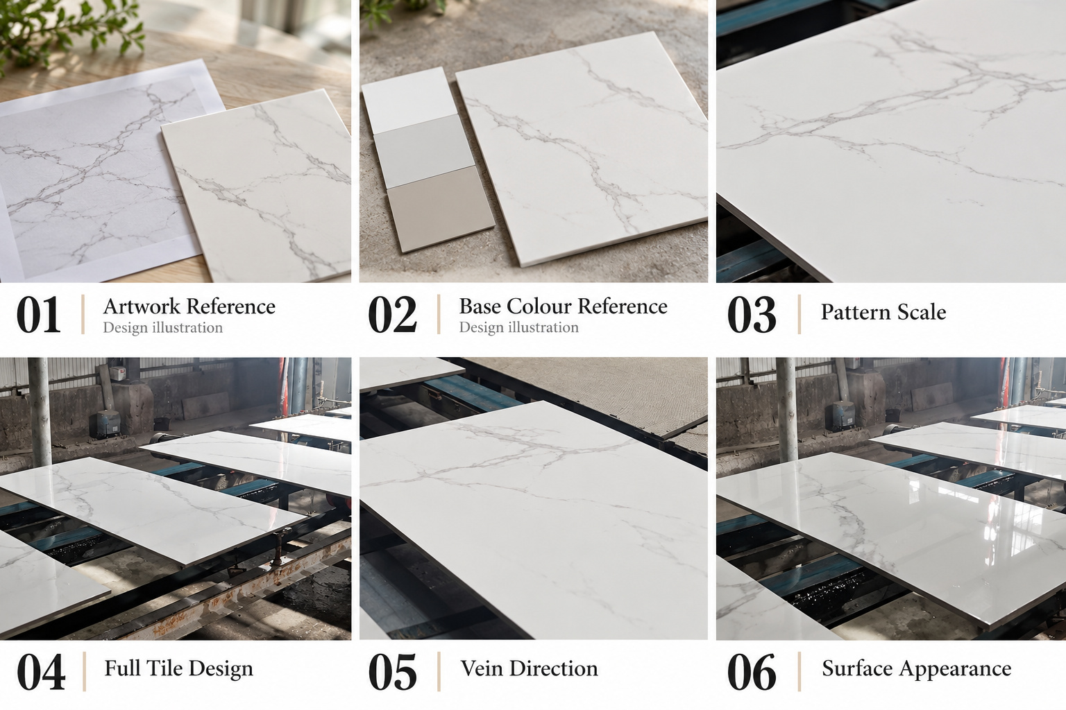 Reviewing Artwork, Scale and Pattern Variation
Send the highest-resolution artwork available, together with the intended tile dimensions and a physical reference where possible. Files taken from screenshots may lack the detail needed for a large tile face. Artwork ownership or permission to reproduce the design should also be clear.
For designs with multiple faces, confirm the expected variation across the range. Buyers should review vein scale, repeat frequency, orientation and how different faces work together when laid out.
A continuous pattern across adjoining tiles requires a specific layout review. It should not be assumed from an individual sample. Our colours and pattern customization page covers these design decisions in more detail.
Approving Colour on Fired Samples
Screen colours and printed paper references provide direction, but the fired tile is the practical reference for approval. Ceramic inks, glaze layers, the body and firing conditions all influence the final result.
Review samples under consistent lighting and record the accepted colour range, pattern and finish. A Pantone reference can help communicate a target, but an exact match should not be promised before development.
Gloss also changes how colour and texture are perceived. Confirm the intended surface effect together with the colour rather than approving them separately.
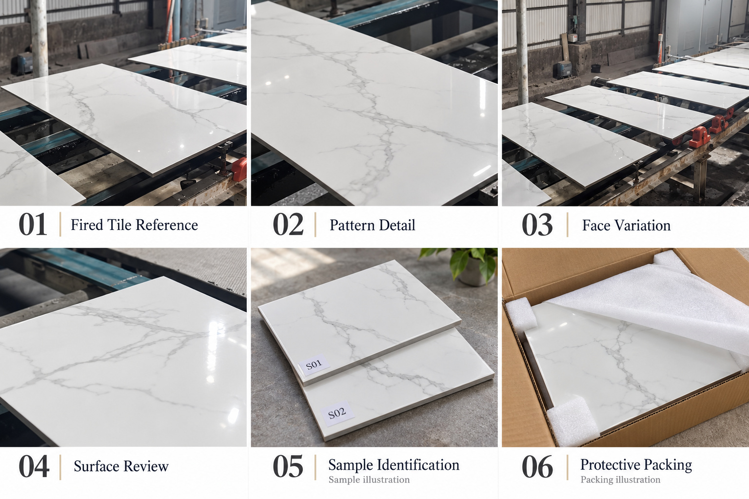 Maintaining the Approved Design Through Production
Production review should compare the tile with the agreed reference for colour range, print clarity, pattern placement and visible surface defects. Relevant defects can include missing print, unwanted lines, glaze irregularities or damaged edges.
Repeat orders need the previous sample identification and product specification. Separate production batches may vary, so requirements for adjoining project areas should be discussed before scheduling.
The approved reference should be retained and protected through the sample development and approval process.
Send Your Design Requirements for Review
Provide the tile category, size, finish, artwork or reference sample, estimated quantity and destination market. Include the required number of design faces and any layout restrictions.
We can then review feasibility, sample costs, MOQ and lead time. Packaging should protect the selected surface, while carton labels and packing details should identify the agreed product for shipment.